Venue Hotel
The development of the Venue Hotel concept involves a strategic approach to communication design that merges aesthetics, branding, and user experience to create a cohesive and inviting atmosphere. The design process begins with understanding the hotel’s target audience, including business travelers, tourists, or locals seeking staycations. The visual identity, including logo, typography, and color palette, reflects the hotel’s unique style—whether it’s modern luxury, boutique charm, or eco-friendly.
Logo and Visual Elements
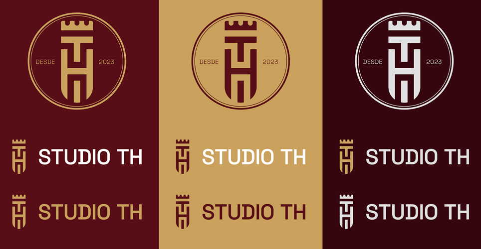
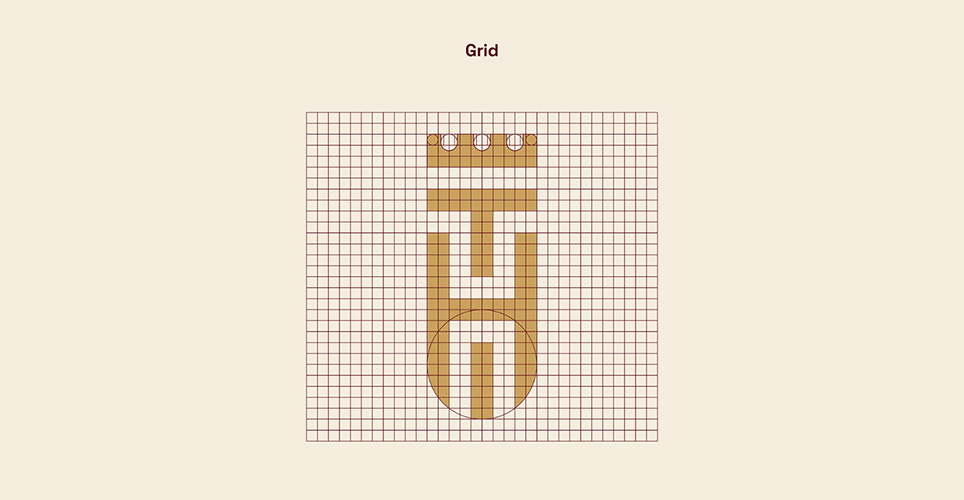
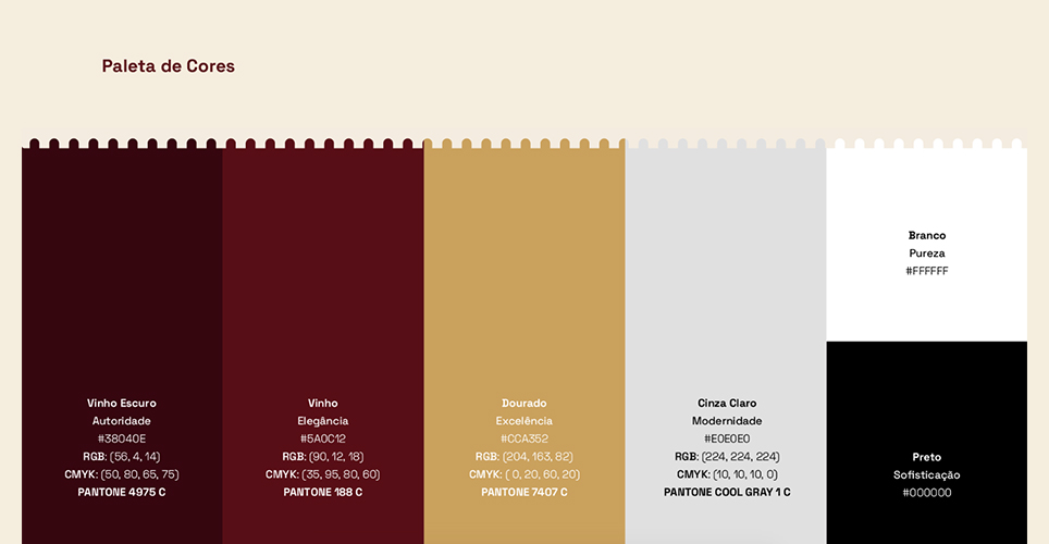
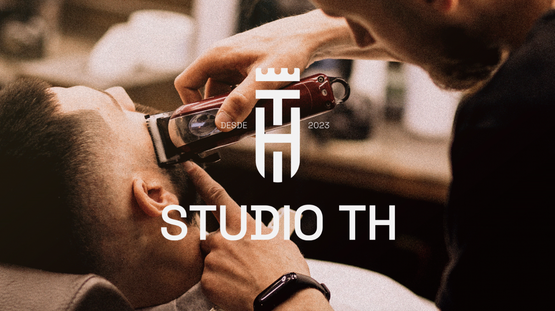
The TH Studio logo is a fusion of modern aesthetics and classic barbering elements. A sleek, minimalist design captures the essence of precision and attention to detail. The color palette, a mix of bold blacks, pristine whites, and accents of metallic silver, evokes a sense of urban chic, underscoring our commitment to a cutting-edge approach.
Fully Responsive design
TH Studio isn’t just a barber shop; it’s a destination where style and precision converge.
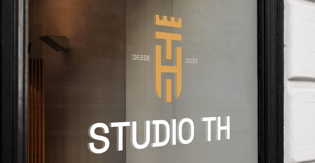
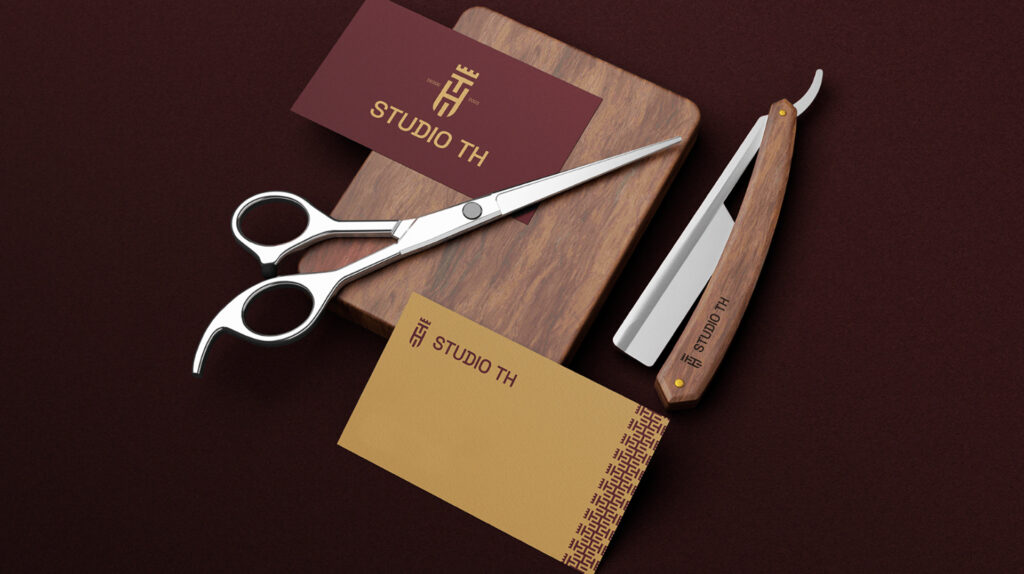
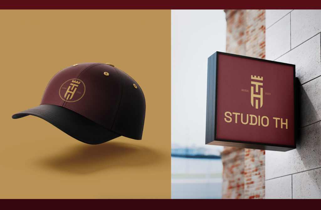
An iconic barber pole, reimagined in a sleek and stylized form, serves as a symbol of TH Studio’s heritage and commitment to classic barbering. This emblem is strategically incorporated into branding materials, creating a visual link to the timeless artistry of our craft.
This attention to detail ensures that every member of team is a walking ambassador for the TH Studio identity.


